Geography of Social Lending
Over the last few years, the idea of applying computer assisted pattern recognition, or more commonly known as machine learning, to social lending has sort of stuck with me. Somewhere in 2015, myself and a colleague, first looked at this problem space. I may write about the machine learning aspect in a future blog post, but that is not the focus in this piece. It was not until recently that I began to think of lending in the context of geography. Could visual patterns be teased out from the available data? There is an existing article on the topic, but the granularity of the analysis is at the state level. Similar to that geographical analysis of Prosper, there’s also a look at Lending Club at the ZIP3 level. I wanted to get to a smaller unit of political geography. Before I get into this, let’s give some context to what exactly Social Lending is all about.
The basic idea with social lending is a person who wants or needs a bit of money. The person makes a listing for a loan use an online platform like Lending Club or Prosper, instead of going directly to a bank. Social lending, more commonly known as peer to peer lending, sells the idea that it offers opportunities for both borrowers and lenders to reach their own objectives outside of direct interaction with banks. Lenders, big and small, have a potential opportunity to put their money to work, while borrowers are able to access money through an alternative to traditional bank loans and credit cards. As with many transactional things in the era of the Internet, both lenders and borrowers fill out forms via web pages on the respective platforms. To give background to the size of the peer to peer lending industry, by early 2015, the largest peer to peer lending platform, Lending Club, had facilitated over six billion dollars worth of loans1. With an active listing on one of the platforms, potential investors in the loan that may result for the listing, review the listing’s information and decide whether to commit some amount of money to the final loan.
A bit of the appeal of peer-to-peer lending, along with being an alternative source of money for borrowers who might have difficulties accessing credit through other channels, is how these loans are securitized into notes and presented to investors. Let’s take a quick detour into securitization.
The basic idea of securitization is to take many financial obligations, e.g. loans or debts, pool them together into an even larger thing, and then chop that larger thing into small pieces. The small pieces are then sold to investors, who expect an eventual returning of their initial investment with interest payments along the way. Securitization has been around for a long time. In the 1850s, there were offerings of farm mortgage bonds by the Racine & Mississippi railroad. These farm mortgage bonds had three components 1) the note, which stated the financial obligation of the farmer to repay the stated mortgage amount; 2) the mortgage, which offered the farm as collateral; and 3) the bond of the railroad, which offered its reputation for repayment in addition to other other assets. 2 In the 1970s, the Department of Housing and Urban Development created the first modern residential mortgage-backed security when the Government National Mortgage Association (Ginnie Mae or GNMA) sold securities backed by a bundled mortgage loans3. There also a fascinating looking-back-in-time at a moment in securitization history in a Federal Reserve Bank of San Francisco Weekly Note from July 4, 1986.
The peer-to-peer lending industry, with a focus on everyday people who want to invest in these loans (as opposed to large banks, and private equity investors) is slightly different in how loans are securitized. Instead of bundling many, multi-thousand dollar loans into a pool, and then dividing the pool into notes, a single loan, for example, in the amount of $10,000, is divided into notes in denominations ranging from $25 up to thousands of dollars. An investor could buy a single $25 note, or she could buy a larger percentage of a given loan. As an aside, a widely held objective in investing is to maximize return on investment and reduce risk. A diversification of the risk is supposed to be achieved by buying a slice of many different loans4.
Let’s get back to the topic at hand: the geography of social lending. First, the data. I will be using data from Prosper. There’s a tremendous amount of work behind getting these data into a shape and structure that lends itself to both looking at things geographically, as well as simply getting historical data that matches the data for the listing that borrower made with the data for the loan that was made following the listing. This process involved first having an investment account with Prosper, and then applying for an additional level of access for finer grained data. Without the finer grained level of access, the problem becomes an issue of record linkage; tying listing data to loan data based on the interest rate of the loan, the date of the loan’s origination, the amount of money the loan was for, the state of the borrower, and a couple other characteristics. It is fairly accurate, but if one is able to get true listing to loan matches, just use that.
Location. Location. Location.
Contrary to what was said in the Orchard Platform’s article on geography and Prosper, locations at a finer resolution than state are available. There are, however, a couple caveats. The first being, it is the text in this field (borrower_city) is freeform and entered by the borrower. There is no standardization. You might get a chcgo, a chicgo, or the actual proper noun spelling, Chicago, for the city’s name. It also appears that entering a city name might be optional, as there are some listings with an empty city. The other caveat for borrower_city, is that it is available only in the historic data downloads, and not available via Prosper’s API. Why is a finer grained location interesting? Because, if you were an investor, you might want to include a prospective borrower’s city in your judgement on whether or not to invest in a loan. I won’t trust those Minneapolis borrowers. In my mind, this actually the reason this information is suppressed at the time of an active listing. There are laws and regulations in the US that state lenders are not allowed to discriminate based on age, sex, and race. Fair lending laws have been on the books since the 1960s and 1970s5, and so lenders have been keen to avoid perceptions of discrimination based on these characteristics. Even so, both Prosper and Lending Club, in their early days, had pieces of information shared by the prospective borrowers. Things like a photo of the borrower along with a message from the borrower were posted in the listing. Photos could leave an impression of age and race, while the notes often included references to the person’s spouse with associated pronouns6. Both Prosper and Lending Club have the exact addresses for successful borrowers, there are know your customer rules and regulations, after all. By not exposing this sliver of information at the time of an active listing, the lending platforms are potentially covering themselves from both actual discriminatory liability, as well as perceived public relations issues (that doesn’t mean that one of these platforms does not periodically have both — likely a paywall on that link, by the way).
At the start of the last paragraph, I mentioned the messiness of these free form city names. How does one cleanup these data into a normalized, relatively accurate location? Google. Google, through its cloud services business, offers relatively good name standardization, and geocoding services. So, putting chcgo, or chicgo into their system, results in Chicago, IL with a bunch of other information, like the county it is located in, as well as latitude and longitude information for both a bounding box around the entity as well as a centroid.
The Google geocoding service, I should add, after a point, it is not free. Up to 2,500 uses, there is no charge, for each additional 1,000, it is $0.50. With a total of 477,546 loans with associated listing data, this seemed potentially expensive. Instead, I collapsed down the borrower’s city and state into a unique value, and fed that into the geocoding service. Getting a unique set of city and state combinations significantly reduced the number of things that I would need to geocode; from nearly 478,000 individual loans, down to about 22,000 combinations. These standardized city/state/coordinates are then reattached to the original data. Not every user entered city was able to be identified. Entries like chstnt+hl+cv, md and fpo were not identified. FPO and APO (also found in these data) are military installations, Fleet Post Office _and _Army Post Office, respectively. The loan/listing entries with locations that could not be identified via Google’s Geocoding Service were removed from these data, resulting in less than 10,000 listings, or 1.9% of the total, dropping off.
I should also give some temporal context to these data; the data range in dates from November 15, 2005 to January 31, 2018.
With a collection of finer grained locations (of unknown quality, I should add), what questions can be visualized with these data?
Orchard Platform’s article on geography of peer to peer lending, as you recall, looks at state level aggregations of data. The piece looks at choropleth maps of loan originations by volume, loan originations per capita, loans with 30 days or more past due, and finally a map of normalized unemployment rates.
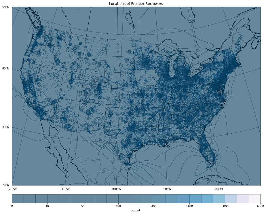
The two maps, above, are originations by place at a city level. It is effectively showing nothing more than where people live. It’s a population map. It is what someone should expect. You will see more loans originating from the Los Angeles or New York City area than the Fargo, ND/Moorhead, MN area. There’s just more people (much higher population densities) in the first two metropolitan areas than in the latter; each of those two higher population metropolitan areas are also spatially larger. The New York metropolitan area, for example, is 13,318 square miles, while the Fargo/Moorhead area is only 2,821 square miles.
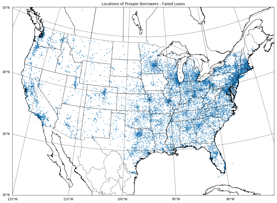
Even looking at just failed loans, which one of the above maps does, is still only identifying where populations live.
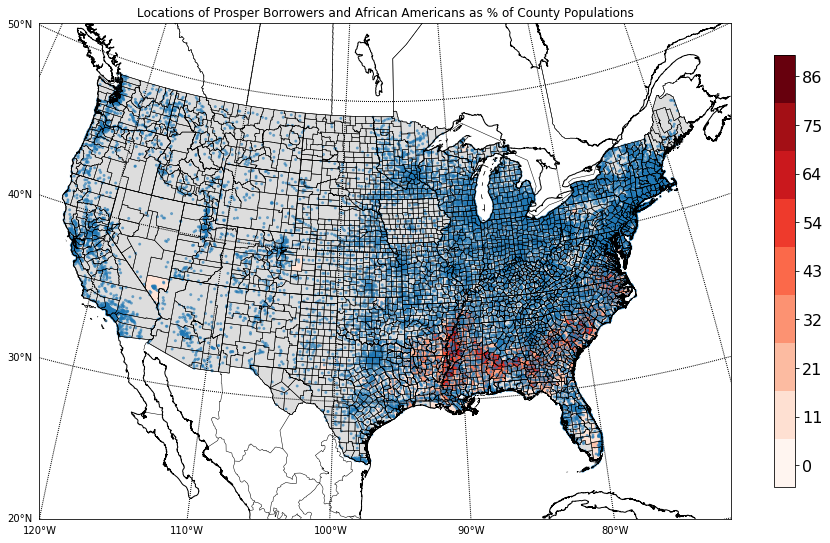
What if you wanted to look at loan originations and whether there appears to be a concentration within counties in the US that a significant proportion of a county’s population is African American?
First you would need data on race, at the county level in the United States. The US Census Bureau’s American Community Survey is a great source for this type of information. In addition to data on race, you need this information tied back to a counties or census tracts or states. There’s a product made by the Institute for Social Research and Data Innovation, called the National Historic Geographic Information System, just NHGIS7. Along with the census and survey based data, NHGIS has quite a lot of data.
ESRI shapefiles available that tie the data to place spatially. These are the two things needed.
The above map, with its blue Prosper loan locations, and the red colored choropleth, representing the percent of a county’s population that is African American, on the surface is interesting looking, but it is really only showing where a segment of the greater population live.
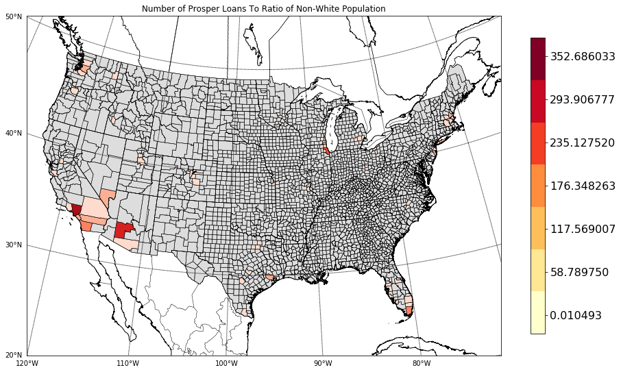
I posed question of race and lending to a colleague of mine, and he thought on it for a short time, and then suggested looking at a choropleth of the number of loans in a county divided by the percent of minorities in a county.
First, define what is meant my minority. In the case of the following, I simply defined this as not white. The 2010 US Census found that White – Alone made up 72.4% of the US population8. Whether or not combining all non-white populations into a single number is the correct thing to do is another story.
In the map to the right, the scatter plot of locations of borrowers is gone, and instead, what is the loan count divided by the ratio of non-whites in a given county. It is another way to slice the data. However, it also seems to just be identifying more diverse populations. Los Angeles, Seattle, Chicago, Boston, Las Vegas, and Albuquerque, for example.
Another way to spin the question is to assume, for a moment, that the loans are evenly distributed throughout a county’s population. If a county was 80% white, 15% African American, and 5% Native American or Alaskan Native, we could assume that 80% of the loans were taken out by white individuals, 15% were taken out by African Americans, and 5% were taken out by Native American or Alaskan Natives. I highly doubt this is the case. It would be possible to get a closer idea by looking at county subdivisions and where the geocoded cities are located within those.
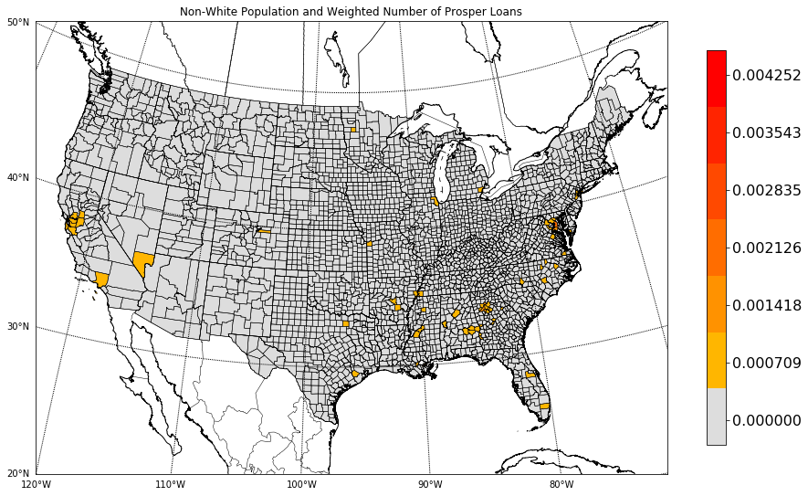
So, taking the idea that things are evenly distributed, you allocate a portion of the loans to non-whites, or one could even look at the individual race groups in the American Community Survey. This proportioned loan count is then divided by total number of non-whites in the county. This should have the effect of dampening high loan counts but low non-white populations.
In the map to the left, there are still some larger, more diverse population centers picked up. Los Angeles, San Fransisco and the Bay Area counties, Las Vegas, Atlanta, Chicago, and Houston.
In addition to this larger population areas, places like Arapahoe County, Colorado, which is directly east of Denver, shows up. Mahnomen County in Minnesota’s northwest area also shows up. There’s also the curious ring around the Washington D.C. area, too.
One final map. Let’s take the same map as the previous, but let’s narrow the focus to loans that ultimately were not repaid; that is the number of loans, weighted by the ratio of non-whites in a given county, divided by the total county population.
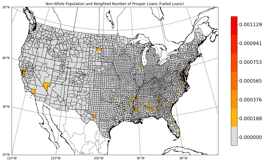
I could keep slicing and dicing things and coming with more choropleths, but I won’t. For a broader look at race and money, Propublica has a fascinating look at bankruptcy and race — Data Analysis: Bankruptcy and Race in America. This report states that Memphis, Tennessee, and Shelby County, where Memphis is located in, have had the highest bankruptcy rate per capita in the nation. It is curious to see that Shelby County, Tennessee, Desoto and Tunica counties in Mississippi, as well as Crittenden and Saint Francis counties in Arkansas all show up in the above map. These are all counties that are part of the greater Memphis area.
That’s it for now.